Let's Ride website
The Challenge
Two problems needed to be solved at once. First, the cycling studio space, especially at the boutique level, tends to look a certain way: dark, moody, intense, aspirational in a way that can feel exclusive or even intimidating. The local competition wasn't doing anything dramatically different. Let's Ride wanted to feel like an alternative to all of that: warmer, more inviting, more fun, and unmistakably local.
The second problem was Let's Ride runs a hybrid business model that combines traditional memberships with a donation-based drop-in option. I personally looked at other cycling studios that offered non-standard pricing structures and left their websites more confused than when I arrived. If visitors couldn't quickly understand how the model worked and why it was a good thing, they'd bounce before ever booking a class.

My Thinking
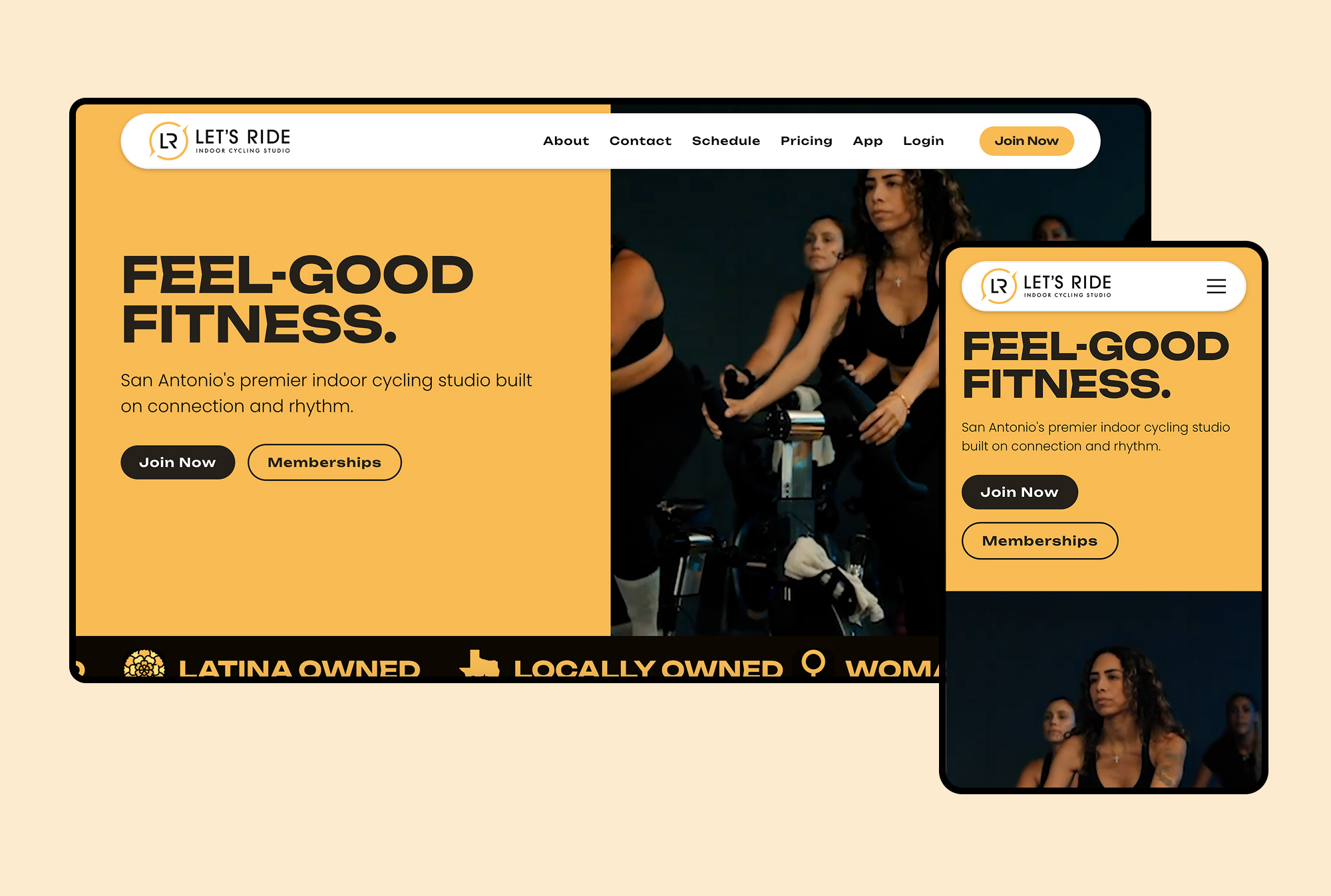
The visual language for Let's Ride needed to lean warmer and more energetic, the kind of brand that feels like it's cheering for you before you even walk in.
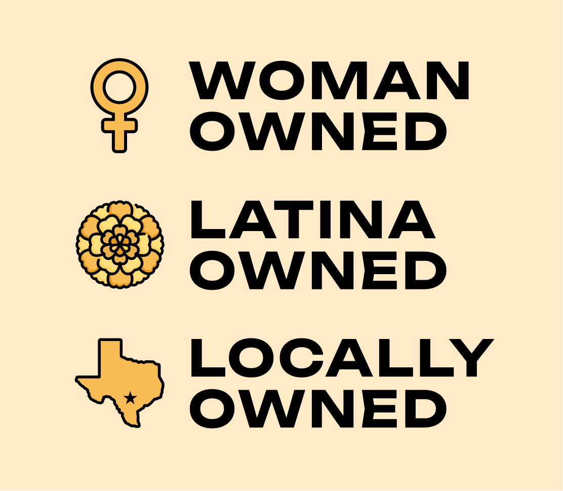
The main pillars: woman-owned, Latina-owned, and locally-owned aren’t buried in an About page. They live in the homepage as a scrolling ticker with custom icons, right at the top of the experience. That was a deliberate choice: these aren't footnotes, they're powerful distinctions.
For the business model explanation, I approached it by naming the two options clearly, giving each one its own space. "The Membership Advantage" and "The Donation Drop-In" aren't just labels, they're framing. One tells you what you gain, the other tells you what's possible. The section walks visitors through exactly what each option means, who it's for, and how it works.
The Result
Let's Ride launched with a brand identity that looks nothing like the local competition. The site clearly communicates a business model that most people have never encountered before, turning what could have been a point of friction into one of the brand's most compelling differentiators.